InfoSol We're passionate about inspired business intelligence
The dashboard gallery below highlights sample dashboards built with InfoBurst Squirrel365, HTML5 with custom coding, and BusinessObjects Web Intelligence that were designed by InfoSol’s team showing the application of data visualization in various Business Intelligence implementations and scenarios.
Click on the image or link in the description to interact with these dashboards.
InfoBurst Squirrel365 Dashboards
InfoBurst Squirrel365 is an exciting new low-code/no-code application and dashboard development solution.
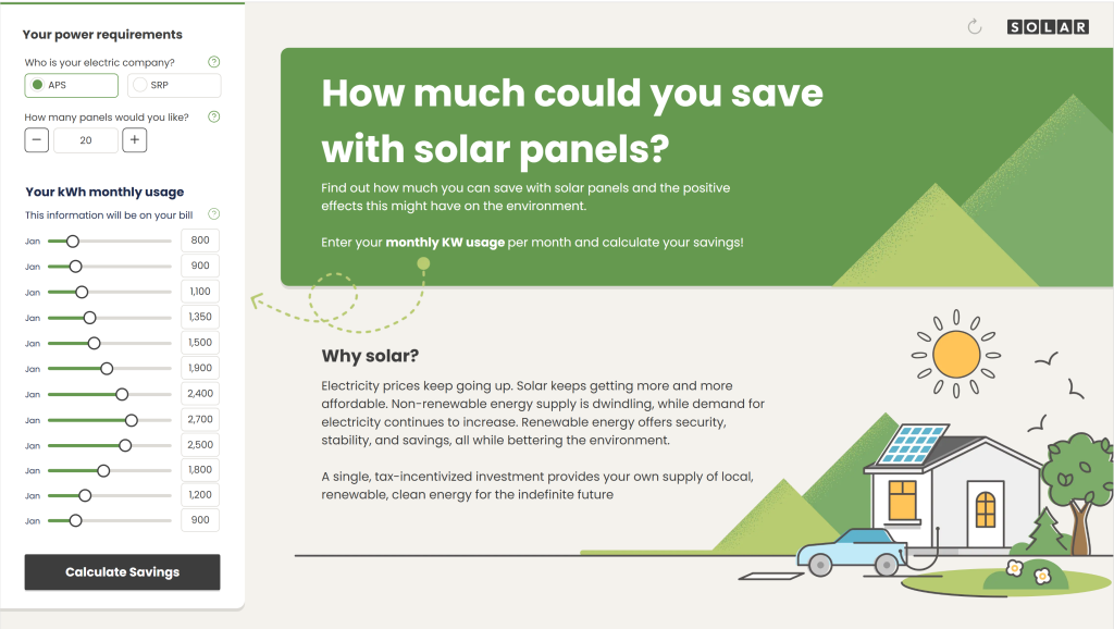 The Solar Panel ROI Dashboard calculates how much you can save by switching to solar energy with the Solar ROI dashboard. Try out different customizations to find the right system for your needs, see your potential returns and positive environmental impact, and download your results.We also have a mobile version of the dashoard.
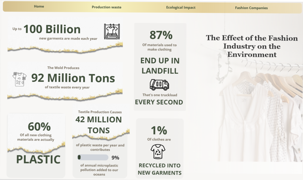
Circular Economy for the Fashion Industry, The fashion industry’s transition from a linear economy to a circular economy has the potential to significantly reduce environmental harm by embracing sustainable practices like reducing waste, reusing materials, and recycling. This dashboard highlights the transformative power of small, strategic changes in driving a more sustainable future for the industry.

The CO2 Emissions Calculator Dashboard, built in Squirrel, gives you the ability to see the impact that your organization has by generating an estimated carbon footprint based on a few simple questions regarding employees and office space. Not only that, but you can see what impact you would have on the world if every company operated similar to yours, as well as seeing where you fall in the bell curve of all other organizations.

The Global Wood Pellet Trade Dashboard gives an overview of the wood pellet market across the globe. You can see the trends of exports and imports of wood pellets across various regions, the detailed raw numbers, as well as a Sankey chart to create a dynamic visual of where pellets are coming from and going to. With the ability to filter for different regions and years, this gives us a powerful insight into the global market of wood pellets.
 Development Profitability Dashboard: The Development Profitability Analytical Dashboard is a Squirrel Dashboard. The dashboard shows incredible flexibility and functionality using a combination of infographics and Squirrel Components.
The dashboard KPIs focus on the top ten United States cities to assist developers and investors to understand and make decisions based on immediate growth areas, economic trends, development costs, and crime rates.
The custom design includes dynamic charts and tables, dropdown menus, dials and slider objects are capabilities that can be transferred to any dashboard.
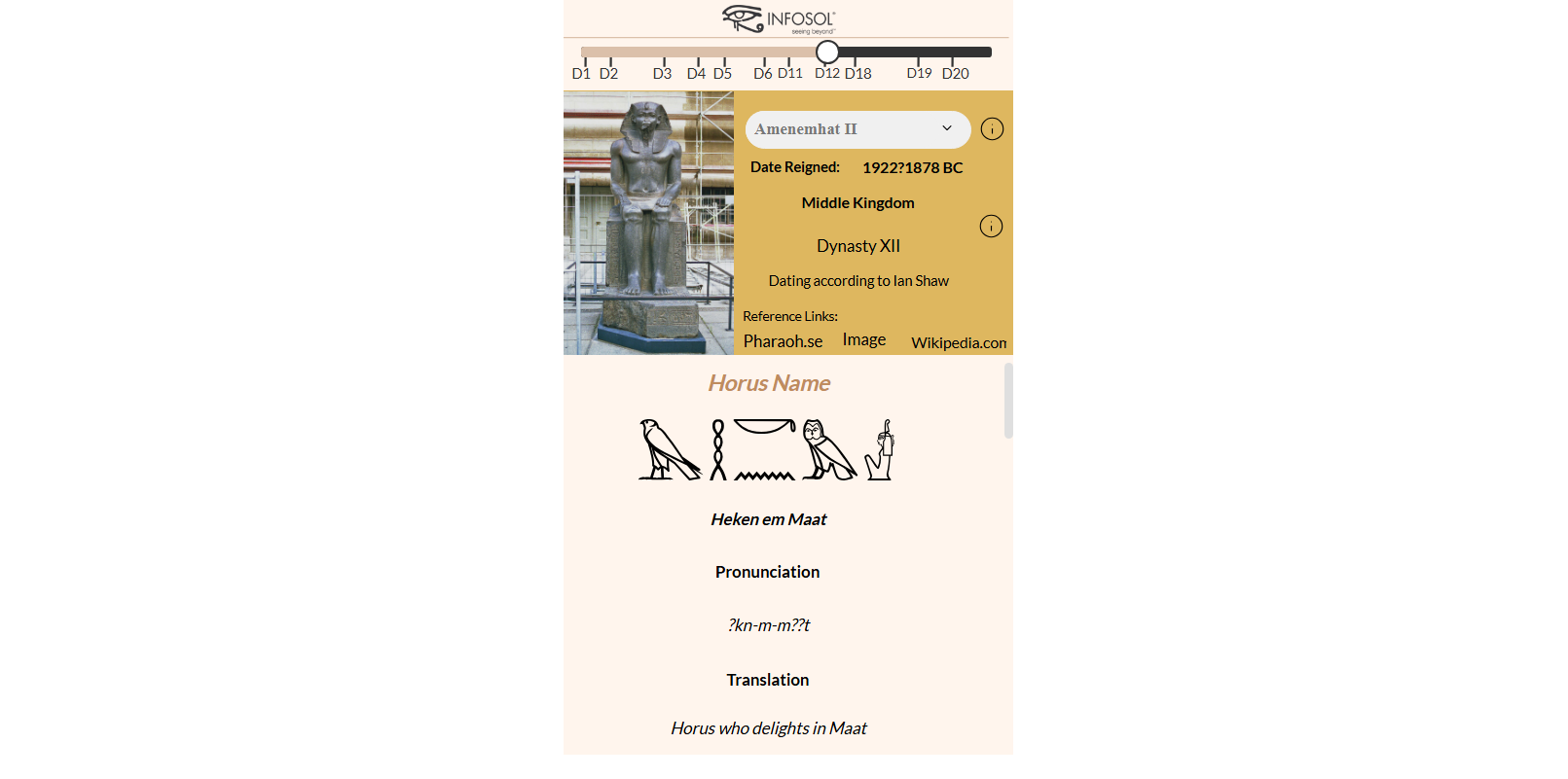
Kings List Dashboard: Scroll through history! Learn about the Pharaohs of the Archaic Period, Old Kingdom, Middle Kingdom, and New Kingdom. Explore the names, royal titles, and dynasties of legendary rulers like Narmer, Djoser, Hatshepsut, and Ramses II. See when they ruled, and how they left their mark on Egyptian history.

Drive Better Squirrel: The Drive Better Dashboard was originally designed in custom HTML5. The InfoSol dashboard design team recreated the dashboard using InfoSol’s latest Squirrel dashboarding solution.
The challenge was to recreate the exact look and feel of the custom HTML5 drive better dashboard within Squirrel. All functionality was recreated in Squirrel except for the 3rd page (shuffler).
The Driver Better analytical style dashboard answers the question “what is the environmental CO2 emissions and financial expense of my driving style depending on auto?” The users of the dashboard include prospective buyers, existing auto owners, and auto sales members.
The custom design includes dynamic charts and tables, dropdown menus, dials and slider objects are capabilities that can be transferred to any dashboard.
 School District Planning Dashboard: The School District Planning dashboard was developed for the Arizona School Districts CFO’s, School board members, and legislature to track spending and budgets by district. Originally, the data was tracked in an excel spreadsheet. Community members, school board members, school district finance departments use the dashboard to make finance and budget decisions and review benchmarks based on the district’s revenue, expenses, and budget management. The dashboard allows flexibility in views and detail to visualize the information over multiple year trends and district comparisons.

Ministry of Health Dashboard: The Ministry of Health Dashboard is a Squirrel365 designed Dashboard. InfoSol’s dashboard design team built the dashboard for the Ministry of Health. Note: Mock Data is supporting the MOH dashboard.
The dashboard is an interactive tactical dashboard monitoring the hospital’s KPI’s in real-time. The hospital management and leadership teams monitor and track all MOH’s hospital efficiencies and quality metrics.
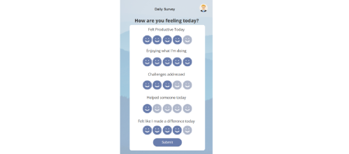
Wellness Buddy App: This app was created to help you track your wellness by answering a few questions each day. It’s set up solely for you as an individual, ensuring that your responses remain 100% anonymous. This way, you can see how you’re doing personally on a daily basis without any concerns about privacy. You can set monthly goals and track your scores day by day, month by month, and eventually year by year. Our goal is for you to add this app to your tool belt for personal development and growth.
HTML5 Dashboards

Red-light Camera Dashboard (Being Updated – Check Back Soon!): Red-light Dashboard is an operational and Geo-spatial dashboard designed and developed in house using modern responsive principles and technology such as Angular, NodeJS and MySQL, and Google Maps. This Dashboard displays financial statistics using a traffic, parking, and violations data.

World Wildlife Fund (Being Updated – Check Back Soon!): The World Wildlife Foundation Dashboard is a custom HTML5 dashboard InfoSol developed in JQuery. The objective of the dashboard for the WWF is to monitor and grow the tiger population. The robust dashboard monitors the Tiger’s landscape and environment in addition to monitoring the tigers’ fauna and flora ecosystem. The WWF’s objective is to double the tiger population by 2022.
The WWF dashboard is used globally by governments and NGOs to understand the direct impact of their efforts to protect and improve wildlife habitats in their countries. The dashboard is inspirational by showing the global improvements countries are making on their wildlife environment.
In partnership and support of the World Wildlife Foundation, InfoSol designed and hosts the WWF Dashboard.
Web Intelligence Dashboards

Alerting Dashboard: The Alerting Dashboard is a custom-built Web Intelligence dashboard developed in SAP BusinessObjects 4.3. Designed to identify and highlight operational anomalies, the interface features sophisticated visualizations including thermometer charts, bar charts within a table, custom fonts, KPI Tiles, interactive push buttons as well has custom HTML buttons. As critical data changes, alerts and smart links guide users toward the necessary next steps.
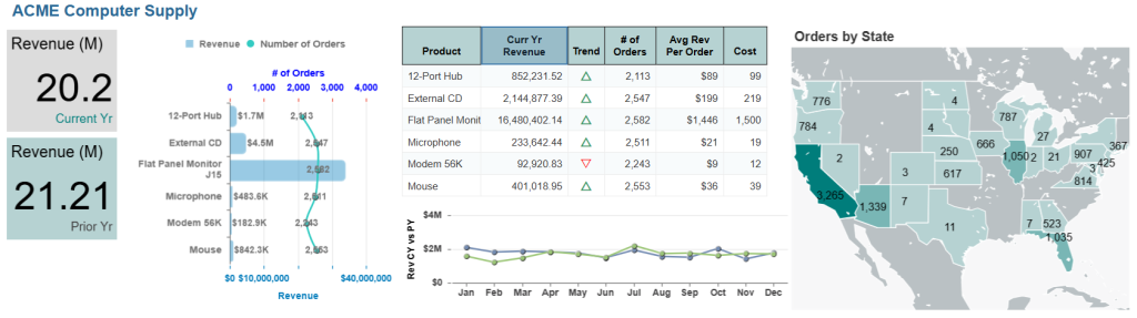
Vendor Summary Dashboard: The Vendor Dashboard provides a comparative performance analysis of our product vendors to evaluate their profitability and logistical efficiency. It serves as a strategic tool for procurement or supply chain managers to monitor high-level financial health while drilling down into specific product-level metrics.
 Strategic Dashboard: Designed for hospital group leadership, this Web Intelligence Strategic Dashboard transforms multi-facility data into actionable intelligence. Through a streamlined, infographic-led design, users can monitor high-level performance or drill into department-specific metrics such as wait times and risk factors. This interactive approach ensures resources are allocated where they are needed most, optimizing the patient experience from admission through discharge.